LONDON LIVE

Sunfest-style live round — design review

A front-end rethink: moving London Live off the print-editorial “weekly read” feel and onto a contemporary, mobile-first LIVE app feel — now/next bands and a bottom-nav PWA — inspired by the Sunfest Live app, aimed at a 20s–40s London Ontario audience. Below: the direction call, the architecture call, then each screen component with options and a recommendation.

Reviewed: 28 Jun 2026 Standalone mockups — live app untouched Real events + r2.dev images Nothing committed / deployed
Decision 1

The direction: live vs editorial

Two skins of the home screen, built on the same real events. The LIVE direction is the headline proposal; the dialed-back editorial sits beside it as the lighter-touch contrast, so you can confirm you are rejecting the “weekly read” magazine feel.

Recommendation

Go LIVE. The Sunfest-style live home is the right bet for a “what is on right now” product and a 20s–40s audience: dark live hero with Happening Now / Starting Soon / Tonight bands, a real-time clock, an off-white feed below, and a fixed bottom nav. The editorial direction is shown only to prove the contrast — it keeps a tasteful serif accent but strips the masthead, issue number, ticker and hero spread. Useful as a fallback voice, not the destination.

Live — Sunfest-style

Recommended

Dark near-black live hero at the very top (the nightlife / “on right now” feeling). Three stacked bands — Happening Now (red pulse + progress bar + “22 min left”), Starting Soon (indigo countdowns), Tonight (amber poster strip). Below, a warm off-white feed of the big photo cards with category tags, save and ticket buttons. Fixed bottom nav (Now / Browse / Map / Discover / Saved). Its own font voice — Anton + Archivo, not Sunfest’s Bebas + Abel.

London Live, live direction, mobile home
Live — mobile (scroll)

Editorial — dialed back

Contrast only

Keeps the editorial DNA but strips the print apparatus. Warm newsprint paper, a sparing Fraunces serif (tiny wordmark + short lead line + event titles only), riso category accents as a thin signal. No centred masthead, no “Issue 04 / weekly read” line, no ticker, no hero spread, no pull-quotes. Sticky app bar with real search, one filter row, a slim stats strip (141 events this week, 55 free, 6 tonight), content above the fold.

London Live, editorial direction, mobile home
Editorial — mobile (scroll)

Desktop adaptation

Live: bottom nav becomes a left sidebar rail, the hero becomes a three-column live board (Happening Now / Starting Soon / Tonight), the feed a 3-up grid. Editorial: sticky bar + filter row, three-up card grid.

Live direction desktop
Live — desktop (recommended)
Editorial direction desktop
Editorial — desktop (contrast)
Decision 2

Architecture: bones vs style-only

How do we get the live feel into the real product? Two routes — fork the Sunfest codebase, or keep London Live’s Next.js and rebuild only the front-end in the Sunfest visual language.

Bones — fork the Sunfest codebase

Fork the Sunfest Vite / React app and reskin it. Fastest path to the live feel because the now/next + bottom-nav structure already exists.

Pros

  • Fastest to a working live shell
  • Structure (now/next, bottom nav) already proven

Cons

  • Loses Next.js static export
  • Loses programmatic SEO (per-event / per-category pages)
  • Loses the 100 themes
  • Two codebases to maintain; a rebuild dressed as a reuse
Recommended

Style-only — keep Next.js, rebuild the front-end

Keep London Live on Next.js (static export + programmatic SEO + the 100 themes intact) and rebuild the front-end in the Sunfest now/next visual language. The Sunfest mockups become the design spec, not the runtime.

Pros

  • Preserves programmatic SEO — the growth engine
  • Keeps static export + theme system
  • One codebase, one deploy pipeline
  • Live feel is a skin + new components, not a platform swap

Cons

  • More front-end build than a straight fork
  • Now/next live logic rebuilt rather than inherited
Recommendation

Style-only on Next.js. The whole reason London Live can grow is its programmatic SEO and static export — forking the Sunfest app throws that away to save front-end time we would spend anyway. Treat these Sunfest-round mockups as the design language to rebuild toward inside the existing Next.js app, component by component (shell, then map, calendar, swipe).

Component 1

Bottom-nav PWA shell

The mobile app shell — the fixed bottom nav and how it frames a screen. Five jobs to carry: Now, Browse, Map, Discover, Saved, with Calendar always reachable.

Opt 1 — Poster Bar

Poster Bar bottom nav

Five flat tabs (Now / Browse / Map / Discover / Saved). Edge-to-edge black bar, Anton labels; the active tab fills its whole cell with that section’s colour, so the bar changes colour as you move. Now carries a blinking live dot. Calendar lives inside Browse.

Pros

  • Closest to Sunfest DNA — feels like family
  • Every job incl. Discover gets a home
  • Reads in bright sun; zero novelty risk

Cons

  • 5 cells is the busiest a bottom nav should get
  • Labels tight at 390px; fills can feel loud
  • Calendar one level down inside Browse
Recommended

Opt 2 — Lift Dock

Lift Dock bottom nav

Four tabs flanking a raised centre Today disc (dated 28, live ping) that opens today’s agenda + month calendar from anywhere. Floating glassy dock; active tabs get a tinted icon + colour pill, not a full fill. Discover folds into Now / Browse.

Pros

  • Today / Calendar always in the thumb zone
  • Reads current and uplit, not flyer-loud
  • 4 + centre is calmer / easier to hit

Cons

  • Discover loses a permanent tab
  • Centre button must clearly mean “today”
  • Looser literal Sunfest resemblance

Opt 3 — States board

Active-state reference board

Not a third tab set — a reference sheet. Shows the Poster Bar in all five active states and the Lift Dock across Now / Browse / Map / Saved with the centre Today disc always present. Use it to pick the model, not the screen.

Recommendation

Lift Dock (Opt 2), and keep the Poster Bar’s per-section colour as the accent language inside screens. The dated, pulsing Today button dead-centre in the thumb zone does more for the “what is on right now” promise than a fifth Discover tab, and makes Calendar reachable from anywhere. Discover rides inside Now’s “This week” rail and a Browse “Best of” filter on day one; it can graduate to a tab if it earns it. Opt 1 is the safe pick if maximum Sunfest continuity ever becomes the priority.

Component 2

The Map

Reframed for “what is on RIGHT NOW near me”. Trimmed header, anchored to “you are here” in Old South, and no more dumping every pin on the map at once.

Default screen

Opt 1 — Tonight near you

List-led near-me map

List-led, map secondary. A ranked “Tonight near you” feed grouped by neighbourhood (closest first) with a walk / drive time on every row and red side-flags on on-now items. Sticky dark map on the right mirrors the list and hands off to a full map.

Pros

  • Answers “near me right now” in the first line of text
  • Grouping + walk/drive times = the missing upgrade
  • Fast on a phone; works even map-collapsed

Cons

  • Less of a wow map moment
  • Needs clean per-venue neighbourhood data

Opt 2 — Pills drive the pins

Pill-filtered near-me map

Map-first but filtered, not flooded. Filter pills (Tonight, Free, category...) decide which pins draw — never all 900 at once. You-are-here at the centre of a 1 km ring, a count chip (“6 on tonight within 1 km”), a recentre button and a swipeable peek card.

Pros

  • Map finally says “near me” (centre, radius, count)
  • Pills kill the wall-of-pins at the root
  • Strongest single happening-now hero

Cons

  • Leans on tap-and-read; peek shows one at a time
  • Downtown clustering still needs handling
Recommendation

Ship Opt 1 as the default Map screen; fold Opt 2’s mechanics into its “Full map” state. One screen, two depths: list-led by default (the better phone experience, works map-collapsed), with the pill-driven near-me map one tap away for spatial browsing. Both files are already responsive, so this is one component. Build caveat: grouping + distance bands are only as good as venue neighbourhood + lat/lng coverage — a chunk of venues are missing a neighbourhood today, so that field needs filling before this ships.

Component 3

Calendar

Built to the notes: start at today, run 5 weeks (Jun 28 – Aug 1) with no wasted earlier-month space, filter pills, event titles carried inline instead of dot-counts, agenda list underneath.

Opt 1 — Rolling 5-week grid

5-week grid mobile
Mobile
5-week grid desktop
Desktop

Month-style grid that begins on today’s row and runs exactly 5 weeks (Jun 28 is a Sunday, so zero dead space above today). Cells show date, month flag on change, up to two inline event titles + “+N more”, a green dot for free; today ringed red. Agenda below. On desktop, a true two-column app.

Pros

  • Whole-month shape at a glance
  • Inline titles answer “what is on the 1st”
  • Scales beautifully to desktop two-pane

Cons

  • Small phone cells (2 titles then +N)
  • Most traditional / least app-native
  • Agenda pushed below the fold
Phone view

Opt 2 — Week-strip + agenda timeline

Week-strip timeline mobile
Mobile
Week-strip timeline desktop
Desktop

Strips the grid to one horizontal lane. A week selector jumps 5 weeks ahead in one tap; a scrollable day strip shows each day as a chip (weekday, big date, category pips, count), today in red. Tap a day and the lower two-thirds is a vertical agenda timeline. Behaves like Luma or a transit app.

Pros

  • Most app-native, closest to the live feel
  • Agenda is the hero and sits high
  • Colour pips + count give density honestly

Cons

  • Loses whole-month shape
  • Horizontal scroll is a learned gesture
  • Desktop shows as a centred phone frame
Recommendation

Opt 2 (week-strip + agenda timeline) as the phone calendar; borrow Opt 1’s two-column grid for the desktop / web view. Opt 2 fits the live direction — the calendar feels like the same product as the home screen, with the agenda high and central. The month grid is genuinely better on a wide screen, and the app already needs a responsive split, so same data: phone uses the strip, desktop uses the grid. One component, no wasted space.

Component 4

Discover / Swipe deck

Kills the old confusion between “want to go” and “save”. One consistent four-action language everywhere: Skip / Save / Going / Share, keys X / S / G / F, swipe left / right / up / down, tap = read a single event (never a multi-event flyer).

Base

Opt 1 — Clear Action Bar

Clear action bar swipe

A five-chip swipe legend above the card, and a four-button bar where each button shows a coloured tile + the word + the key + the arrow. A one-line helper spells out Save vs Going. A worked tap-to-read example proves tap opens a single event.

Pros

  • Most legible, lowest learning curve
  • Non-swipe path (accessibility)
  • Save/Going helper kills the confusion

Cons

  • Busiest chrome; slightly smaller card
Graft on

Opt 2 — Directional Deck

Directional deck swipe

The four actions printed on the card’s four edges, colour-coded, lighting up as you drag (frozen mid swipe-right with the Save edge glowing + a SAVE stamp). A compact tap row below for pressers. Teaches the gesture on the object you touch.

Pros

  • Teaches the swipe map on the card
  • Most physical / fun; card stays large

Cons

  • Label noise over busy photos
  • Still screenshot under-sells the light-up
Desktop

Opt 3 — Command Deck

Command deck desktop swipe

Wide-screen, keyboard-first. Left rail: swipe-direction diagram. Centre: the big card + four-button bar. Right rail: physical keycaps X/S/G/F/Space with meanings, plus a live “My Plans tonight” list proving Save and Going go different places. Bottom strip: the open read panel.

Pros

  • Best for power use + desktop review
  • My Plans proves Save ≠ Going

Cons

  • Desktop-shaped; collapses to ~Opt 1 on phone
Recommendation

Ship Opt 1 as the base, graft Opt 2’s on-card edge cues onto it, use Opt 3 as the desktop layout. Opt 1 is the honest answer to the brief — four labelled buttons with word, key and arrow, plus the Save-vs-Going helper, so nobody guesses. Opt 2 adds the one thing it lacks: it teaches the swipe directions on the card so people graduate from tapping to flicking. They are not rivals — persistent labelled controls plus light-up edges while dragging. Opt 3 is the same four-action system spread out for desktop.

Queued next

Content task: full descriptions

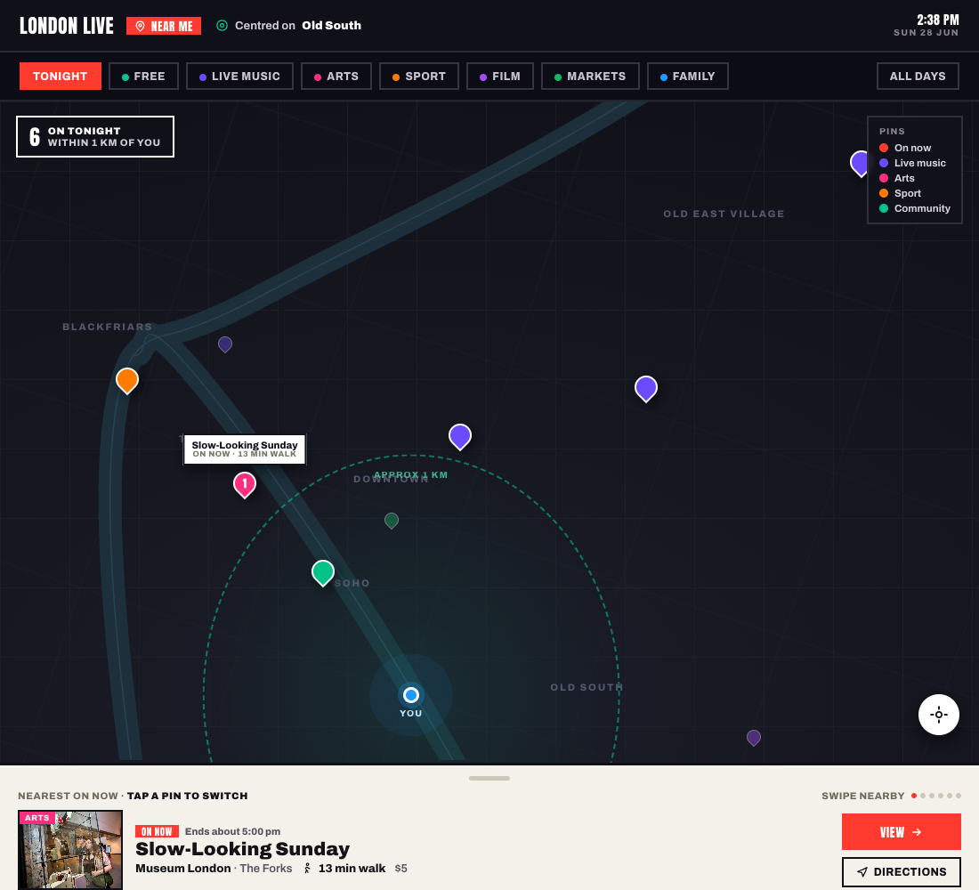
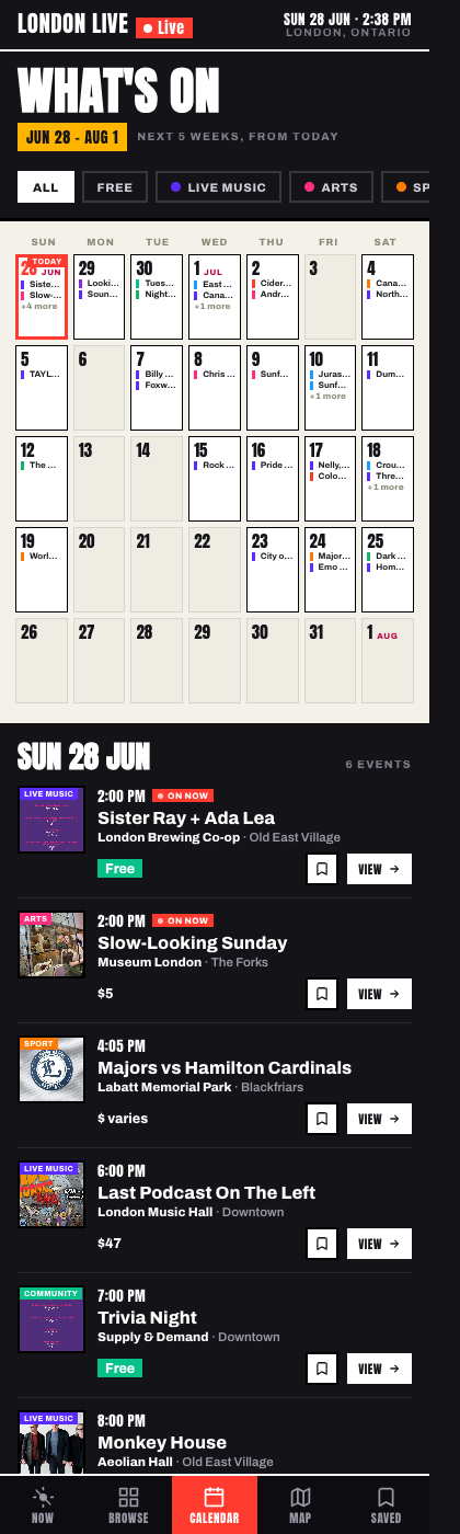
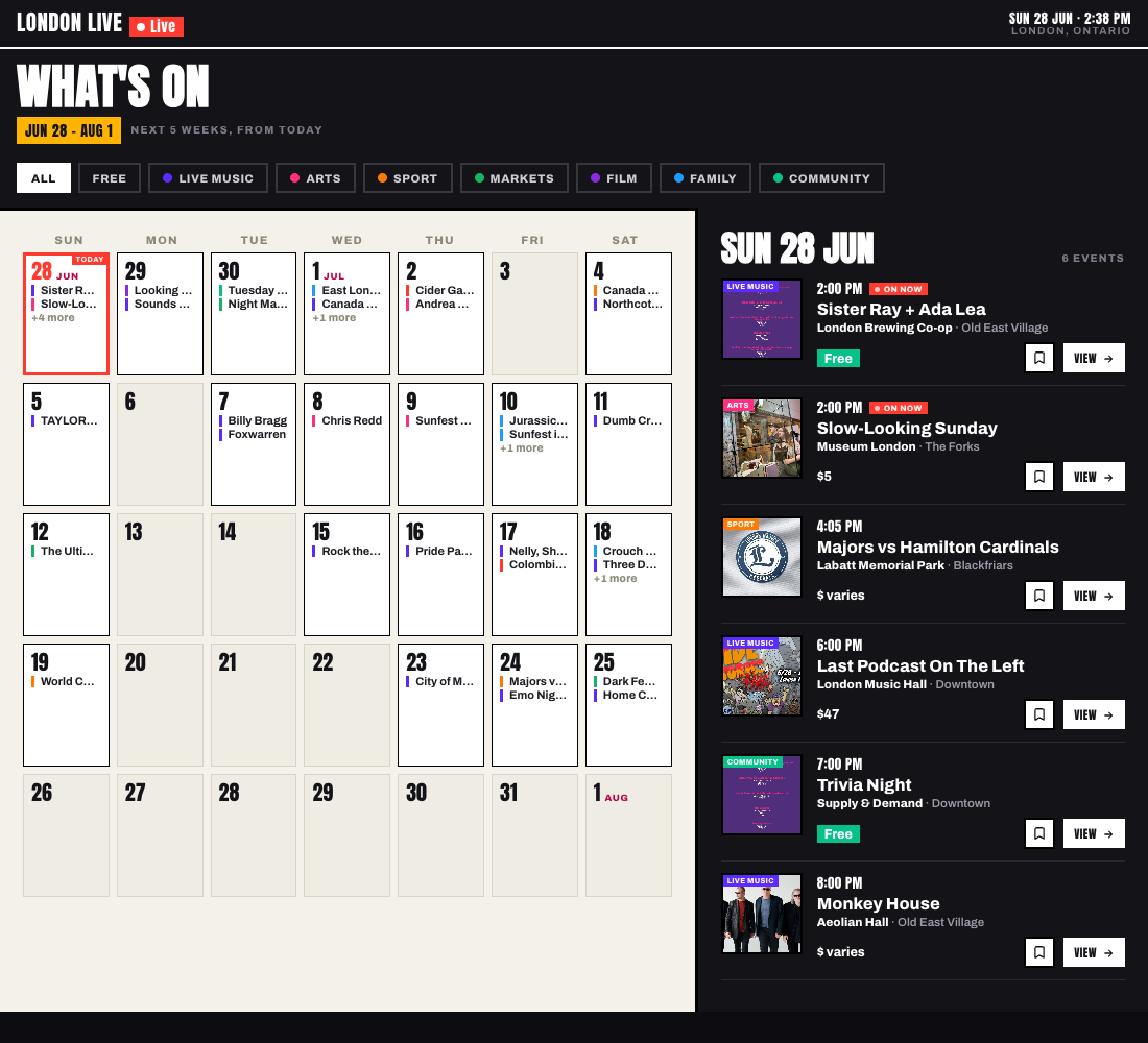
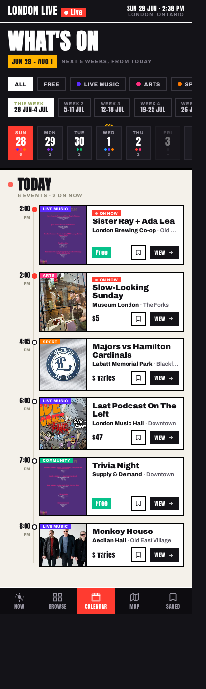
Across every screen, tap-to-read needs a real, single-event description — not a truncated title or a multi-event flyer. The current data mostly carries titles, venues, times and images.

Queued

Full-description scrape + AI-tidy. Extend the events pipeline to scrape each event’s full source description, then AI-tidy it to a consistent house voice (Canadian spelling, no em dashes, captions only from real source data) so the swipe deck’s tap-to-read, the agenda cards and the detail pages all have real copy. Also fill the missing neighbourhood field per venue (the Map’s grouping + walk-time bands depend on it).